[SwiftUI] Creating a Sticky Floating Button with Just One Spacer
03 Apr 2024 |
Summary
🤔 How can I implement a sticky/floating button that satisfies the following?
- It sticks to the bottom when the keyboard disappears.
- It sticks to the right above the keyboard when it is appearing.
Solution
SwiftUI : ⭐️ Spacer ⭐️
UIKit : 1. inputAccessaryView 2. modify constraints by observing keyboard event
StickyButton on Keyboard ? FloatingButton on Keyboard?
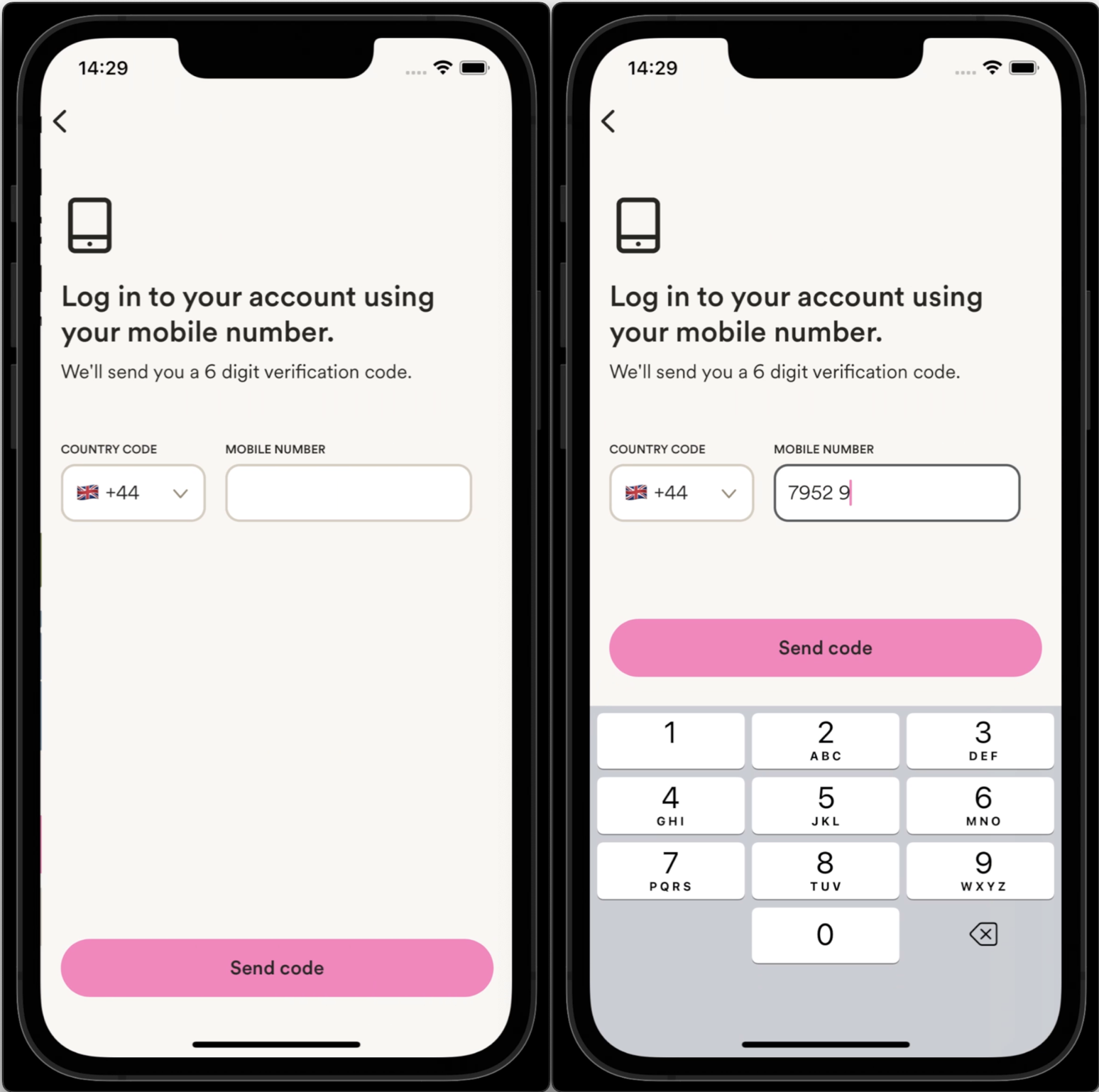
You might come across a button that behaves like this when using apps, typically entering information in textfields.
 (reference: Marshmallow)
Recently, I found absolutely simple and short solution to implement this sticky/floating button in SwiftUI. Just utilize the beauty of Spacer.
Here are the requirements that this button should satisfy:
- It sticks to the bottom when the keyboard disappears.
- It sticks to the right above the keyboard when appearing.
You can solve this by using Spacer!
Here is the detailed code. The crucial part is at the end.
var body: some View {
      ZStack {
        backgroundView
        inputView

        // Here's the view to focus on
        VStack {
          Spacer()
          Button("Send Code") {
            // Add button action
          }
        }
      }.padding(.all)
    }
All you need to do is to put spacer and button in VStack. Make sure that the spacer goes first and then button. Compared to existing solutions in UIKit, it is absolutely simple and straightforward.
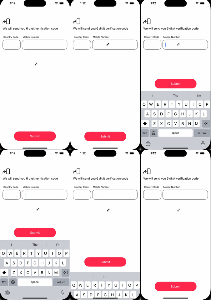
⬇️ Here’s a demonstration of the sticky/floating button implemented using the code described above:
 You can find detailed codes here.
Underlying mechanism
The power of Spacer lies in its ability to fill available space. Let’s break down how it works:
- Keyboard hidden: The spacer expands to fill the VStack.
- Keyboard appearing: As the keyboard rises, the available space decreases. The spacer shrinks, pushing the button upwards.
- Keyboard fully visible: The button sits right above the keyboard.
This elegant solution stems from the Spacer’s expanding characteristic. It simply shrinks as the keyboard rises.
What’s stunning is how much simpler this SwiftUI solution is compared to UIKit. In UIKit, you’d typically use one of two more complex approaches:
- Utilize
inputAccessaryView(official documents) - Update view constraints by observing keyboard events
(These UIKit approaches will be covered in a future article, and you can find the codes in the repository here)